
Monday 16 May 2011
Zansky - Helvete Forest
This is another great illustration by Zansky, I really like the way he uses burgundy lines. The background brown also adds to the effectiveness of the burgundy. it compliments it and is textured, giving it a grainy, dirty feel. The image itself is intricately detailed like his other work and is definitely the right sort of direction in which I want to steer my work.
Other work
This piece of work was a typography exercise where we were told to find type in everyday surroundings. I think I pretty much missed the mark, and went too far with it. I should have just taken photos, but instead I illustrated parts of Leeds new developing skyline and spelled 'Development' with the windows. I liked my final piece but when I saw the others I realised that I had not actually done what I should have done ... Reading the brief properly would have helped.

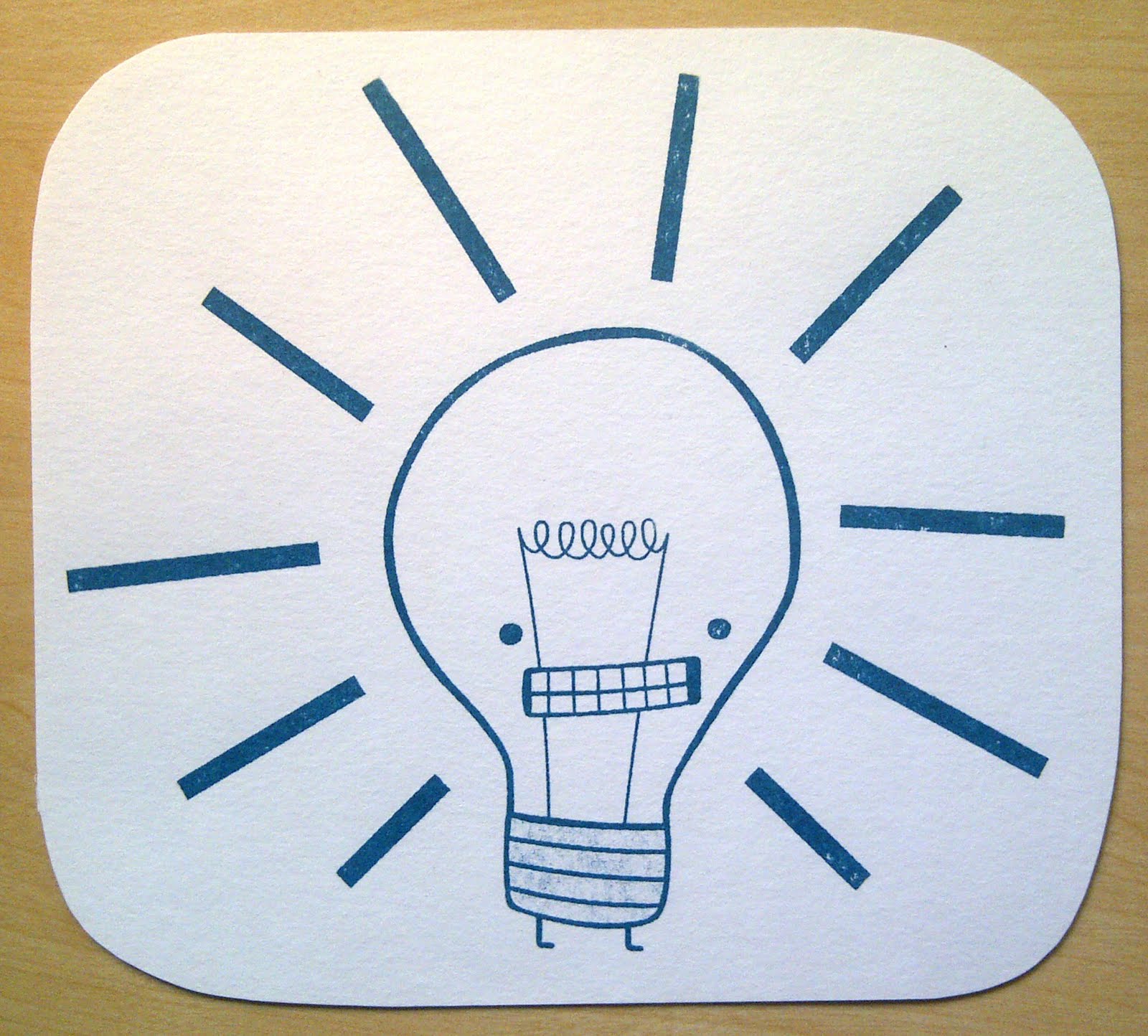
This work was for a mini brief, where we were instructed to create a postcard to place on a wall in the studio. I drew this cloud, and of course I had to put a face on it, it's so happy!

This illustration is of Admiral Ackbar from Star Wars saying the infamous 'It's a trap!' line. This was done for myself and was my first attempt at using Adobe Illustrator. I liked it, a bit difficult to get to grips with at first, but once you get going it gets easier. I would like to practice using this program as the work that can be made using it is amazing.

This is one of my hand cut cards that I like to make, It is a poor imitation of Rob Ryan's style, but with practice, who knows ...

What is Visual Communication?
What is Visual Communication? Was an odd module, it felt strange to create a project but not to actually create something substantial. In the end I printed my presentation, so I had something to show at the end.
The project was basically a research lead project which we would then use in creating a brief for our major project. Mine was about recycling in my local borough, I liked this project, it was different and a bit of a challenge for me as we were pretty much left to decide what we wanted to do by ourselves.


The project was basically a research lead project which we would then use in creating a brief for our major project. Mine was about recycling in my local borough, I liked this project, it was different and a bit of a challenge for me as we were pretty much left to decide what we wanted to do by ourselves.


Contextual & Theoretical Studies
I really enjoyed Contextual studies, was one of my favourite parts of the course this year. I realise that I leaned a lot throughout the module as it provided insight to previous areas of art I had not looked at. This is definitely something to look forward to next year.
Designing for audiences
Designing for audiences was a fun module to do, I liked the challenge and the work which I produced. I chose to look at creating a poster advertising donating to the RSPCA. It was well recieved and was an effective piece of communication in that it conveyed the right tone and message to my intended audience.


Visual Exploration: Book
The book project has been my least favourite project this year, I was not happy with the content or the finished book. I struggled with finding a subject for my book, something that would stand the test of time. This was my mistake, I took too long in deciding, which in turn meant I had less time to actually make the book. The book is about what sort of sandwiches people like to eat in Leeds. After doing this project and having to ask people out and about I can honestly say I will not be doing something like that again. I realise that it is very difficult trying to get random people to answer questions, this was a true learning curve, and I'm glad it happened early on in the course.
The book making was fun, it was great to learn a new skill like that, one which I hope to use in future years, but my choice of colour for the pages was wrong, too dark. If I were to do this again I would have lighter pages, and better content.


The book making was fun, it was great to learn a new skill like that, one which I hope to use in future years, but my choice of colour for the pages was wrong, too dark. If I were to do this again I would have lighter pages, and better content.


Visual Exploration: Zine
Making the zine was the first project we were set this year, it was also the only project in which we had to collaborate and work as a group. Our zine was called 'We are here - Landmarks through Leeds' and it was a mini pocket guide showing some of the iconic landmarks dotted around the city. The project was rather challenging as we all had different ideas, we had only just met each other and everyone was being polite and nice. This made decision making hard as there were hardly any unanimous decisions, in the end zine itself ended up being a nice way for us to explore Leeds as a new city and as outsiders learning its layout.
I liked the zine, we all contributed different styles to the mix, making it a bit more of an obvious team effort, it worked as we had intended it and was pretty self explanatory. The only bad thing was that there were not enough facts and information about certain places.
Here are my pages of the zine:


This illustration is of the bronze statue hands in the Nelson Mandela gardens, it was my favourite contribution towards the zine.

Elective: Visualisation and illustration
My elective was not what I imagined it would be like, it was less focused on drawing and more towards how we perceive drawing, how we look at different things. We were pushed to try new thing, I am stubborn so this grated against me, the work was unspecific and unimaginative. It felt like we were doing children's tasks from a primary school syllabus.
We were told to try new things, encouraged to think outside the box, and on a few occasions I enjoyed the work, but even after completing all the tasks, and trying to experiment I found it less enjoyable than I would have liked.


Workshop: Print room
The print room workshop was my favourite, We were instructed to bring in an image which we would then silk screen print. I brought in one of my illustrations (below) they then photocopied it, making it black and white and then placed it on a screen which had been coated in UV reactive paint. The screen was then exposed to UV light and after a while we were able to take it out and print our images using the racks and squeegee. It was a really good process, a really good skill to learn and something which I will definitely be using in future projects.


Workshop: Wood and Metal
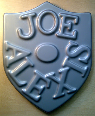
This workshop was more, wood, metal and plastics. We were shown the sorts of things we are able to produse in the wood shop, if need be, this was also the case with the metal work. There are many facilities available to use, the plastic molding equipment was fun to use, I used my shield which i created in the wood workshop as a base on which I stuck letters. All in all it was a fun experience.
But in all honesty I do not see myself using them, I may use the wood workshop in the future if I need to create a plinth or a frame but doubt I will use any of the other equipment available.

But in all honesty I do not see myself using them, I may use the wood workshop in the future if I need to create a plinth or a frame but doubt I will use any of the other equipment available.


Workshop: Ceramics and Jewellery
The ceramics and jewellery workshops were the ones I found least interesting, as I really could not see myself utilizing any of the equipment for future projects. I did make a plaster slab which i made by pouring plaster into a clay mold. That was quite fun, good to get messy and actually create something, that and the technicians were a laugh to work with. But I really do not see myself using these types of processes in future projects.

Workshop: Wet process photography
The wet process photography workshop was really good fun, we were instructed how to use SLRs and told to go out on the street and experiment using different settings on the cameras. We then got the chance to develop th images in the dark room. It was a lengthy process and when I came to look at my film reel there was nothing there. My camera had been faulty and something had gone wrong with the film. because of this on of my class mates kindly let me assist her in developing her shots. It was an interesting process and the amount of time it takes to do this has put me off a bit, digital images are so much easier and quicker to work with.

Ed Nacional
I really like this illustration, the red and blue contrast works well. The transparency of the colours make it interesting to look at, but for me it is the imagery, of staying cool and all the things you would associate with it, swimming, ice cream trucks, rain, icicles etc. A very clever piece of illustration.


Saturday 14 May 2011
Human storage
This has got to be one of the most interesting of the info graphics to look at. Some people are just weird!

Evolution of storage
I have seen something similar done looking at game consoles, but this is still a fun thing to look at. Looking back at the stone ages of virtual memory! *shudders*

Countries whic invest the most in alternative energy
This was not as visually captivating as the other info graphics but it made for an interesting read. Shocking, scary facts ...
Country Codes of the World
This is a clever use of typography, using size and spacing to create a good and identifiable map of the world in web codes.

Periodic table of typefaces
I've seen this before, it is in Simon Garfield's book, 'Just my Type'. It is very clever and well thought out, it would be a very good thing to have printed out A2 and placed on a way, hmmm I might ...


40 Insightful (Yet Deadly Creative) Infographics
So I found this site and it was a really good find! who would have thought there were so many interesting ways to show information and statistics! Well apparently there are, I just had never thought about it until now. This site showcases 40 of the best, some are boring, deserving only a cursory glace (if that) where others are pretty amazing. Informative yet interesting, thats the best way of describing them. Another random find that helped to idle a way a few precious moments of boredom! ...
I will blog some of the better ones after this post, enjoy!
http://www.smashingapps.com/2011/05/11/40-insightful-yet-deadly-creative-examples-of-infographics.html
Rubber - Film poster
I saw this film the other day, it was okay, a bit different a bit slow, but largely a good twist on genres and the conventions that associate us with them. The concept of a psychokinetic tire, which rolls around with a thirst for blood is highly amusing. The film is a really good watch great cinematography, a clever script and all in all it works. BUT what I like the most was this poster! The tagline made me chuckle, it's embarrassingly obvious and poor, but I couldn't help myself ... Anyhow, I liked the retro printed feel, the eye captures the fact that the tire is alive and also evil, the red is like blood and the horizon created by the red and off white can be seen as being the representation of thew flat desert where the film is set. This poster really works, and sums up the film pretty well.

Sunday 8 May 2011
Victor Petit - QR code CV
This is something pretty special! I mean who even thinks of these things? makes me sad and jealous, but mostly jealous! So who would of thought that you could use technology in such a obvious and simple way? Well not me, but that's not the point. Victor Petit's CV uses QR bar code technology to allow him to speak to the person looking at the CV, its both visual and substantial. It is really well considered, the photo, is a good choice, a neutral black and white of his head and shoulders. with a clear outline of where to place the phone, all sized and placed perfectly to show his mouth in proportion and in the correct place. I like this and seriously want to steal this idea ...
Matt Ranzetta
Matt Ranzetta's Star wars posters are on a similar vein to those by Olly Moss. Moss' posters are actually about Star Wars, capturing the essence of the films in an image. Whereas Ranzetta's do the opposite, they take an iconic moment or scene and humorously portray something else. From books, to bands and to record companies Matt Ranzetta's series of posters twist the Star wars imagery to great effect. I really like the style, they look like really good prints and would be a nice addition to any fans poster collection!


Ai Weiwei: Unilever Series - Sunflower seeds
I recently visited the Tate Modern on my trip back home, I wasn't really fussed about going as not much changes there from time to time, but it's free and its a nice way to spend part of the day, it's a nice place, a nice gallery. What I hadn't thought of seeing was Ai Weiwei's amazing Sunflower seeds! I had seen it on the news, but thought that it would not be there still, I'm glad it was.
You walk into the main space and you see a blanket covering the floor, a blanket of hand painted porcelain sunflower seed. It is a humbling experience and quite hard to fathom the actual number of them spread out on the floor or the amount of time it took 1,700 Chinese workers to create. The scale of it is amazing, I was sad that they stopped people from walking across them as Ai Weiwei had originally intended (health and safety reasons) but still it was an experience.
The work looks at mass production, of the Chinese economy which churns out hundred and thousands of goods. It makes you wonder if they are necessary, question the very nature of a society which can produce endless amounts of goods. This is mirrored in the way in which Ai Weiwei employed people to create the millions of seeds, all created with painstaking detail. It is definitely something to see and something which will stay with me for a very long time.
(I did take photos, but they aren't as good as the ones off the Tate website!)


Blu
Blu is a street artist who creates amazing pieces of art, they tend to be large and intricately detailed. These are two images from his online sketchbooks, they are the types of things he paints on walls, they are often weird but I really like the level of detail displayed and the messages in the work. His street art has relevance to the places it is painted, often reflecting the urban or industrial environment. This can also be seen in his sketches and ideas, some of them are really thought provoking. His style on a pad is sketchy and pretty much consists of line drawings, a style similar to Tom Gauld's.


MUTO a wall-painted animation by BLU
This is a video done on street walls by the artist Blu. I saw this on the internet years ago but completely forgot about it, I saw it again in a street art book in the library. It is a really amazing thing to watch, the amount of time and paint it must have taken would have been quite the undertaking.
25 Examples of Illustration and Hand Drawn Elements in Web Design
I found this article as I do with most of the ones I come across, randomly. It seems to work, I'm gonna go with it. It is a collection of illustrative websites that are really nice and cool to use, they are all very visual. My favourite being the bottle one, (Jan Ploch) as the liquid drains and refills as you scroll up and down, very clever!


Analogue

Jan Ploch
Lego film posters
These posters are all a clever spin on this summers blockbusters, mirroring the layout and style of the original posters but using Lego! They are really clever illustrations, the Lego figures are all in proportion and look just like their human counterparts! I like the style of illustration and the way they have been manipulated, a great distinctive visual style. You really can't go wrong with Lego, everyone thinks its cool.


Subscribe to:
Posts (Atom)