Sunday, 27 March 2011
Zansky
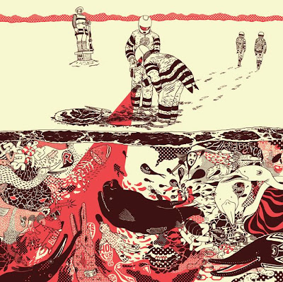
Zansky creates amazing artwork, his illustrations are vibrant and visually stunning, he uses colour to great effect. With the second image, a cross section of a sea full of creatures and meat, he uses a burgundy for the colour of the lines. I think this, set against the cream of the background creates a good contrast. The effect is that the red, cream and burgundy make it seem a bit like bacon and meat, very organic and slightly grotesque. I like this and again this is something which I will look at incorporating into my style of work.
Subscribe to:
Post Comments (Atom)


No comments:
Post a Comment