Thursday, 31 March 2011

Erik Månsson

This image intrigues me as it reminds me of Remed's characters and shapes, he uses patterns and very clean lines with lots of rounded edges and curves. This added to the style of the skull against the blackness of the head and shoulders is very similar to Remed's. I really like the contrasts of the black, white and yellow, and the way that they over lap in creating a very symmetrical foreground. What I dislike are the shapes in the background, they seem out of place, they use gradient tones to create a sense of shape and add depth where in my opinion is not needed. Overall I like the image, I like the clean lines and curves of the shapes.

http://www.flickr.com/people/erimansson/

Josh Holland

I am largely unsure about this illustration, it stood out and I like the artists style but there something which does not sit right when I look at it, and I am unable to pin point what that is. What I do like about  the style is the neon colours of the blobs and the way in which they are somewhat translucent. I like the use of line and the way in which the artist uses outlines to make the shapes in the foreground standout from the shades of the background. This gives the illustration depth and is a really good technique and the main reason I like it. I like the artists style, the boldness, the rounded edges, it all seems very substantial and solid. 


http://art.josholland.com/

Nathan Walker

I love the grotesqueness interlaced with the comical and somewhat cute characters! Very interesting to look at, one of those images where you see something new each time you look! 

This shark just doesn't give a fuck!

This is just a random illustration. It made me laugh.

... Yet it's so true!

Sunday, 27 March 2011

Tony Kuchar

I like Kuchar's work, especially this series of pieces about horizons. The work itself is stylized as if it was printed but looks like it has been manipulated and aged digitally. I like the technique and the clean crisp lines he creates for his horizons. The colours and the aged look of the work is what do it for me, these pieces work both individual and as a set, the only down side to the colours and shape of the 'suns' are that they kind of look like the Nurofen logo. That being said, the work is no less impressive to look at. 


Davi Augusto

Augusto's illustrations are very technical, and precise. They lean towards looking like cell shaded animations rather than hand drawn sketches. I think that He has created these images using illustrator and that the use of colour is especially good. What I liked and connected to the most was the tiniest of details. The way which colour sometimes goes over the lines, this is something I do in my own work. The bleeding of the colour makes it feel less perfect and more of a hand drawn, hand coloured illustration.


Zansky

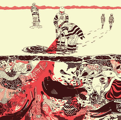
Zansky creates amazing artwork, his illustrations are vibrant and visually stunning, he uses colour to great effect. With the second image, a cross section of a sea full of creatures and meat, he uses a burgundy for the colour of the lines. I think this, set against the cream of the background creates a good contrast. The effect is that the red, cream and burgundy make it seem a bit like bacon and meat, very organic and slightly grotesque. I like this and again this is something which I will look at incorporating into my style of work. 


Brian Dettmer - The book surgeon

I saw Brian Dettmer's work on a random article on facebook of all places. The article described how he would take a book or a series of medical journals, cut and glue them together to create sculptures of interwoven images and text.  His work is very similar to Su Blackwell, but where hers is more about creating scenes and dioramas with books, Dettmer's seems to be more focused on a style of visual and intricate complexity.


Alexei Vella

Alexei Vella is a Canadian artist who created the Walrus image for the Ark project. He uses a retro screen print style that utilises both patterns and colours. The image itself is done in a comic book/pop art style with the red half-tone pattern overlaying the walrus. I like this style and am intrigued as to how it was made, if it was made using screen printing techniques then they are very complex and confusing with a multitude of different colours. Overall the image itself is great, it gives off a retro chic look that makes the walrus' smile all the more amusing and captivating.

This is the last piece of work from the Ark project book, I really enjoyed it and as I said before I will be buying it, not only to help the animals around the world but also because its cool!

Cecy Meade

Cecy Meade is a Mexican artist who illustrated the Vaquita marina. She uses block colours and lovely flat shapes to construct a happy and idyllic scene. I like the way she uses bright and vibrant colours to make a radiating warmth, for me the smiling sin captures the essence of the work and steals the show away from the two Vaquita marinas.

64 Colors

64 Colors is made up of two American based artists, Laura and Eric. They both collaborate on work and incorporate different styles into their work including, illustration, screen printing and elements of graphic design. Their Porcupine piece looks like it draws its influence from Japanese cartoons and animation, the characters are very cute and have very expressive emotions in their faces.


Diego Medina

Diego Medina is a Brazilian artist who produced a really intricate and complex image of the Pirarucu or Arapaima. The Arapaima is an incredibly weird fish to start off with, put along with Medina's zany background it creates a very weird image. It is amazing to look at, so finely detailed with hundreds of different things happening in the back drop, but the Arapaima cleverly steals the show by being a lovely golden orange which immediately draws the eye. The line work is very very good, nice and curvy flowing lines, again this is something that resonates with my own style and stood out from the rest of the book as being one of the best on show.


(his own site is nigh impossible to navigate...)

Joshua Agerstrand

Joshua Agerstrand is a Guam based artist who produced the artwork for the Ko' ko' bird. The work is a great line drawing which has had the colours digitally added afterwards, I like this technique and I like to use it a lot, it is very effective at producing a clean crisp image with lovely bold colours.


FRM Kid

FRM Kid is a graffiti artist from Poland, His artwork which was featured in the Ark project was about Storks. The work is very geometrical and looks like a piece of graffiti art, the image is full of detail and has a great social context showing the danger of animals living along people in a modern society.


Edel Rodriguez

Edel Rodriguez created the art for the Cuban Trogon or Tocororo bird. The work looks stunning, Rodriguez has used a number of different techniques, a multi media style to create the image. It looks as if he has stencil painted the different sections of the bird onto a piece of card, then painted and inked in details and the other elements of the image.

I like this idea, personally I am not very good at painting, but the idea of stencilling an image using paints is very interesting, sort of like a one off easy screen print.


The Ark Project

The Ark Project is pretty much an illustrated bible of different animals from countries all over the world. The idea of it is that the people behind the project (DGPH) choose an artists from different countries who are asked to illustrate an animal that represents their country. They hope to save animals all around the world with some of the proceeds from the book. This book not only has very noble ideals but is amazing! its one of the best illustration books I have ever looked at, again I loaned it from the library but its so good I think I will actually buy it! There are over 200 different illustrations of all different animal species around the world by some amazing illustrators and designers.

I am going to do the same as I did with the 3x3 annuals and post a few which I found inspiration and pretty awesome ...


Valeria Petrone

Valeria Petrone is the last artist from the 3x3 annuals which really stood out for me, her style is like Mike Lowery's in that it is very much line based and organic. She uses sketchy lines and her images are quite abstract and different.

Overall I think that the 3x3 annuals were really worth looking at, they have given me so much inspiration and so many different ideas. I really would recommend anyone interested in illustration to have a flick, something to occupy a couple of minutes or simply as a way of trying something new.


Morgan Schweitzer

Morgan Schweitzer is a really impressive commercial artist/illustrator. His work ranges from concept designs, character designs, storyboard art to illustration. The work which was posted on his official website was pretty much a large collection of different pieces with a varied type of visual styles. I liked this, his sketchbooks showed the development of his drawings, observations etc ... I have decided that I really like artists who show their sketchbook work on their sites, its very revealing into the processes of how they produce their work.

The illustration which I like the most was his 'Flight of the conchords' piece. I LOVE the show anyway and to see such awesome fan art done for no particular reason just made me smile. Such an awesome piece of art, captures some of the weirdness from the show too! hahaha


Mike Lowery

Mike Lowery's art speaks volumes to me, his illustrations are silly and kind of like my style. I absolutely loved looking through his website and viewing his sketchbook work. This style is something which I want to develop further in my own work. His lines are messy, organic and the subject of the drawings are all pretty much comical. I really really love this free style of drawing, where mistakes are incorporated into the work, they are just accepted as is and this is something which I really need to get to grips with when illustrating in the future.


Saturday, 26 March 2011

Matt Murphy

Matt Murphy is another politically motivated illustrator, I looked through some of his work and projects from his website and found them all to be pretty much amazing. But his work 'Oil' which was also featured in the 3x3 annual stood out the most. I liked the way that the bear looks like its trapped in the thick oil/background, there is oil dripping off his paws and his posture suggests he is crying out. This piece is very suggestive, the red is the colour of blood, the bear is also not in its natural habitat. This could be seen as making a point that humans have destroyed the bears environment and natural habitat. The bear which is a natural predator in the wild has become a victim to the greed of oil.

I really like this work, I love the contrast between the black and red and just love the way that so much thought has gone into creating such a great image.


Hannah Radenkova

Hannah Radenkova's poster for 'Peter and the wolf' is an amazing image! When I saw it in the 3x3 annual I was not able to see the brush strokes of the wolfs fur, the picture in the book, did not do it justice. When I saw the image online it was completely different, instead of just being a contrast between the white and black, I was able to see the mark making and detail of the wolf, especially the shadow around the eye. This changed the image for me, gave it much more depth and character, the wolf leers at Peter and although he is small, Peter defiantly stares back. I love this image, very captivating.


Cristiana Couceiro

Cristiana Couceiro is a Portuguese artist who likes to use a variety of different styles and art to create amazing collages and images. I particularly liked her 'Daylight and the sun' series of images as they are lovely scenic black and white photos with overlaying blocks of colour and geometric shapes. The vivid colour on top of the monochrome photos creates a great contrast. By looking at the images I think she created them digitally but they could also be produced via screen printing the colours over the images.


Brian Stauffer

Brian Stauffer is an American illustrator from my selection of artists featured in 3x3. I really liked the political messages in both bits of work, they are very visual pieces with a great message.


Adam McCauley

Adam McCauley uses a retro screen print style, some of the work appears to be very reminiscent of American adverts and artwork from that era. I really like the style and the use of techniques.


Aaron Meshon

Aaron Meshon is another illustrator from the 3x3 annuals, his illustrations are heavily influenced by Japanese Kawaii culture where most things look cute and have a face. I like this and think that his maps of America are humerus and good natured, they have a great sense of depth, where the images have a sense of perspective whilst still embracing the two dimensional flatness with which they were meant to be viewed.


Aad Goudappel

Aad Goudappel is a Dutch illustrator who has received honours from 3x3 and Communication Arts.His artwork is very crisp utilising clean edges and clear cut lines. His work appear to be very much vector based, with the images probably being produced using Illustrator, yet the angles and style seems to reminiscent of screen print artwork. I like this, a use of a classic style, but with clean lines and colours.


Three by three illustration annuals

Whilst looking for inspiration amongst the shelves of the college library I came across these little treasures! I got out two 3x3 annuals, No. 5 and 7. Unlike other illustration journals which I have looked in for inspiration the 3x3 books seemed different, for one they are organised into different categories; advertising, animation, books, editorial ...etc. which means that there is a very broad selection of illustrators and a great collection of all their different styles.I really enjoyed flicking through them looking for new and interesting artists, they are definitely good source books! 


 After flicking through both annuals, I have come across a number of artist which I find quite interesting, The posts to follow are from this selection ...

Languagesfr>en YahooCE
blogs